How To Lose Readers (Or Marks) Through Poor Data Visualisation
In SIPBS we don’t actually deduct marks for poor data visualisation - we don’t use “negative marking” at all, in fact - but it is possible not to earn marks because of deficiencies in data visualisation.
On this page, we will look at some (real, anonymised) examples of poor data visualisation, to demonstrate some common errors with the goal of helping you avoid them in your own work. The figures below commit the kinds of errors we see frequently in student theses (and occasionally papers), with commentary on the problem and how it might be improved.
Axis labelling
Make your axis labels confusing
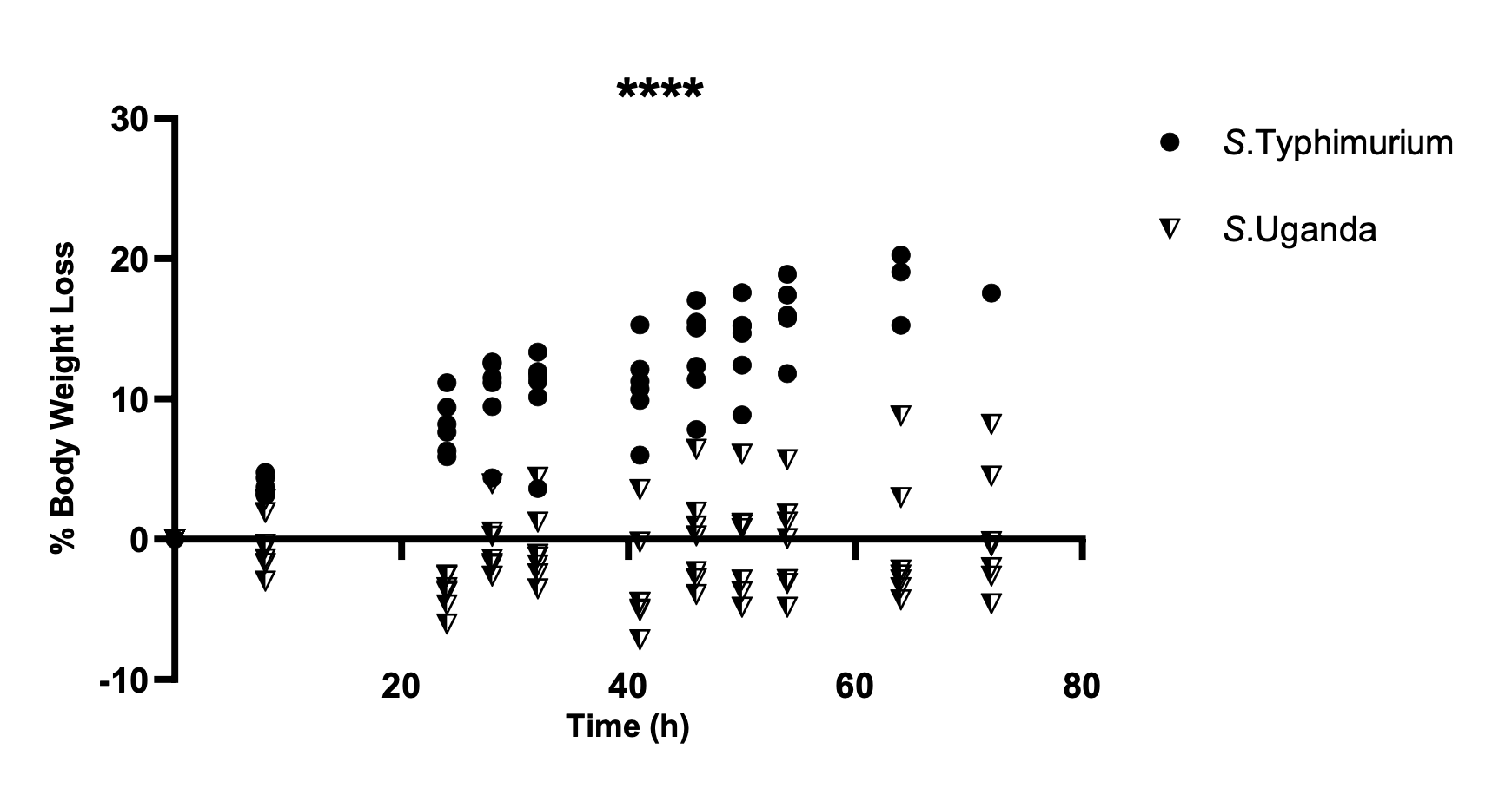
Figure 1 shows the percentage of weight loss relative to a baseline weight (here, weight measured at 0 hours post infection), but the y-axis label and orientation is poorly chosen.
In general, in Western cultures at least, progress is generally interpreted from left-to-right, and lower values are considered to be, well, lower than higher values.
In Figure 1 the y-axis represents loss, so a change in the positive direction (upwards on the y-axis) means a reduction in weight. This, by itself, is counterintuitive and unhelpful to a reader, but is compounded because there is both “positive loss” (i.e. weight loss), and “negative loss” (i.e. weight gain).
This labelling means the reader needs to invert the intuitive direction of change and keep in mind that “negative loss” means gain.
The y-axis could have been presented as “% Weight Change” so that values above zero represent weight gain, and those below zero represent weight loss. This would be more intuitive and not require the reader to keep in mind that “negative loss” is the same as “gain.”
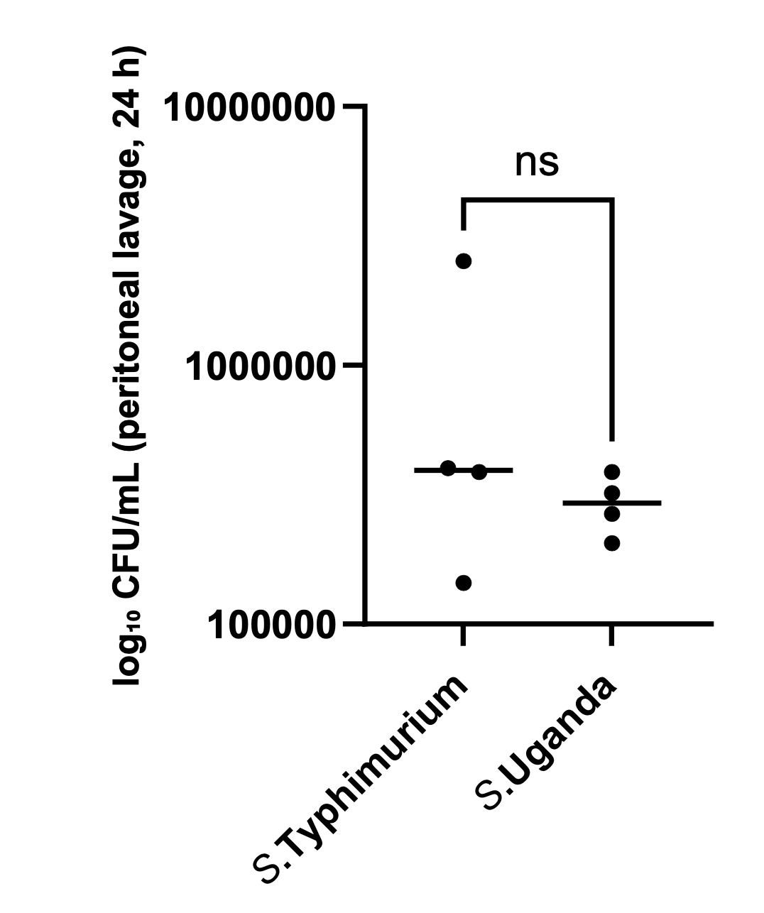
Figure 2 shows counts of bacteria in peritoneal lavage, 24h post infection. Bacterial counts are typically found as counts of colony-forming units (CFU). Because these counts are large numbers and bacterial growth is exponential, they are often presented as log(CFU). So, if \(\textrm{CFU} = 100000 = 10^5\), \(\log_{10}{\textrm{(CFU)}} = 5\).
In Figure 2 the numerical values on the y-axis are actual bacterial CFU counts, but the label indicates that they are \(\log_{10}\textrm{(CFU)}\) counts. If that were actually the case, the lowest count on the y-axis (100,000) would represent \(10^{100000}\), a much larger number than is practical in an experiment.
The y-axis values in Figure 2 are \(10^5\), \(10^6\), and \(10^7\), so the numerical values for an axis labelled as “\(\log_{10}\textrm{(CFU)}\)” should be 5, 6, and 7.
Alternatively, the units on the axis could have been presented as CFU/mL, in which case the numerical values would have been correct.
Statistical results
Don’t show the actual errors or data
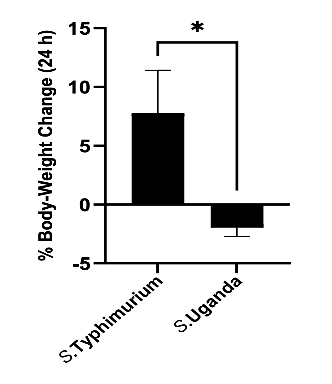
In Figure 3, the error bars are only shown in one direction, although SEM is typically understood (and stated here explicitly) to extend either side of an estimate of the mean. This kind of figure is known as a “dynamite plot” and obscures the true variation of the data.
Figure 3 is an example of a “dynamite plot” where an error bar that should extend either side of the mean is only shown in one direction. The visualisation implies that error only occurs in one direction, and obscures or prevents comparison of the variation of data between groups.
Error bars should always be shown to extend in both directions around an estimate, where variation (or estimates of variation) do so.
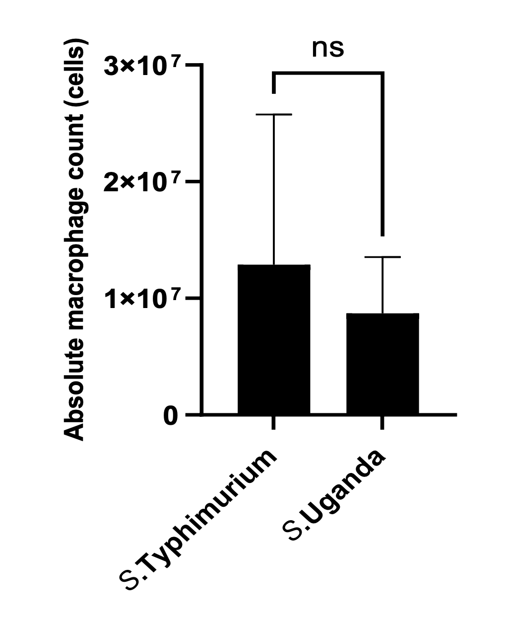
Figure 4 shows count data (which can only have a value of zero or greater) of macrophages in the peritoneal cavity of mice, 24h post infection, for two bacterial isolates. The original legend did not indicate the meaning of the error bars, but the surrounding figures state that error bars represent SEM.
The Figure 4 error bar for S. Typhimurium only extends vertically above the mean absolute macrophage count. This is a “dynamite plot” and undesirable because it is not truly representing the (here, presumed to be SEM) actual estimate of error. But in this case it is also disguising a much more significant statistical error.
Careful inspection of the length of the Typhimurium error bar shows that it is larger than the estimated mean. This implies that the SEM error bar in the other direction should extend below the zero count. **This is equivalent to stating that (i) it is possible to have a negative count of macrophages, and (ii) that the uncertainty in the data is such that the mean count might be negative.
Obviously, the true count cannot be negative, but the statistical analysis implicitly allows/assumes it to be possible. This should strongly guide the researcher towards a different statistical analysis.
In this case, the usual solution of simply showing the error bar properly above and below the mean estimate will not solve all the issues, although following good practice this way might have helped the analysis.
Here, the key is to note that the data is count data which specifically can only take counts of zero or greater. This kind of data can sometimes be understood to follow a Normal distribution without causing problems, but more generally is better represented by a different kind of statistical distribution.
To avoid the impossibility of the implications of a Normal distribution/SEM here, a boxplot or violin plot could have been used to visualise the data distribution.