2 The Grammar of Graphics
It may take a couple of minutes to install the necessary packages for WebR in your browser - please be patient.
Right-click on the link below to download the gapminder data
2.1 Introduction
In this section you will meet ggplot2, a very popular and powerful data visualisation package in R. We will also learn about the “grammar of graphics,” a way of thinking about constructing data visualisations that also is the source of the gg in ggplot2.
The grammar of graphics is a set of concepts relevant to visualising data. It separates the data from the way the data is represented, which may be a new approach to you - it’s certainly different to the way Excel and Graphpad Prism choose to control visualisation. It is, though, highly effective for generating powerful visualisations that best get across the message of the specific application, rather than relying on a list of predefined graph types.
2.2 Load in the data
In order to visualise data using ggplot2 in R, we have to load that data into R. We have provided the data for this walkthrough in the file gapminder.csv, which can be loaded with the command:
gapminder <- read_csv("gapminder.csv", col_types="fnnfnn")The column types in this data are, in order: factor, number, number, factor, number, number and can be expressed as "fnnfnn" for the col_types option in read_csv().
Using the col_types option means that R “knows” what the data in each column should be, and report problems if they arise.
When you load the data, you will not see any visual indication that the data is loaded. Once you have run the appropriate command in the cell, you should move to the next subsection to see how to inspect the data.
The data is loaded into a dataframe, which is given the name gapminder. We can refer to the dataset using that name in our R code.
2.3 Inspect the data
It is always good practice to visually examine your dataset, to become familiar with your data and check for obvious problems. With the data loaded in, let’s take a look at it and see what it contains, using the commands:
str(gapminder)
summary(gapminder)Here, str is an abbreviation of “structure” and the command will show us the structure of the dataset
The str(gapminder) command shows a detailed account of the types of data contained in the dataset. Focusing on the key part of the output, it shows:
 $ country  : Factor w/ 142 levels "Afghanistan",..: 1 1 1 1 1 1 1 1 1 1 ...
 $ year     : num [1:1704] 1952 1957 1962 1967 1972 ...
 $ pop      : num [1:1704] 8425333 9240934 10267083 11537966 13079460 ...
 $ continent: Factor w/ 5 levels "Asia","Europe",..: 1 1 1 1 1 1 1 1 1 1 ...
 $ lifeExp  : num [1:1704] 28.8 30.3 32 34 36.1 ...
 $ gdpPercap: num [1:1704] 779 821 853 836 740 ...
which tells us there are six columns: country, year, pop, continent, lifeExp, and gdpPercap. Four of these columns contain simple numeric data (num), and two are “factors” (Factor) so are some kind of category. Here the factors are country name and continent.
The summary(gapminder) command shows a summary of the data in each column. For the factors, the first six categories are listed, with the count of the number of rows of data belonging to each category. For the numerical columns, the range of values in that column are shown.
        country          year           pop               continent
 Afghanistan:  12   Min.   :1952   Min.   :6.001e+04   Asia    :396
 Albania    :  12   1st Qu.:1966   1st Qu.:2.794e+06   Europe  :360
 Algeria    :  12   Median :1980   Median :7.024e+06   Africa  :624
 Angola     :  12   Mean   :1980   Mean   :2.960e+07   Americas:300
 Argentina  :  12   3rd Qu.:1993   3rd Qu.:1.959e+07   Oceania : 24
 Australia  :  12   Max.   :2007   Max.   :1.319e+09
 (Other)    :1632
    lifeExp        gdpPercap
 Min.   :23.60   Min.   :   241.2
 1st Qu.:48.20   1st Qu.:  1202.1
 Median :60.71   Median :  3531.8
 Mean   :59.47   Mean   :  7215.3
 3rd Qu.:70.85   3rd Qu.:  9325.5
 Max.   :82.60   Max.   :113523.1
2.4 A basic scatterplot
You can use ggplot2 in a similar way to other tools (like Excel and Prism) to produce “canned” visualisations like scatterplots. Here, we need to specify which data go on the x and y axes, and the dataframe we’re using, and some options like which variable to use to colour datapoints. For example, the code:
qplot(lifeExp, gdpPercap, data=gapminder, colour=continent)will generate a (quick, hence qplot()) scatterplot of GDP per capita (gdpPercap, y-axis) against life expectancy (lifeExp, x-axis) from the corresponding columns in the gapminder dataframe. Each different continent in the dataset will be plotted with its own colour.
Although the plot looks to be nice enough, it’s still constraining and doesn’t really express the power of ggplot2.
You may see a message that warns: qplot() was deprecated in ggplot2 3.4.0. This message tells us that, eventually, qplot() will be removed from ggplot2, as a way of encouraging users to learn ggplot(), as we will in the rest of this workshop.
2.5 The grammar of graphics
To really get to grips with ggplot2 we need to talk about what makes up a plot. We can use the example of the scatterplot you’ve just generated (reproduced in Figure 2.1)
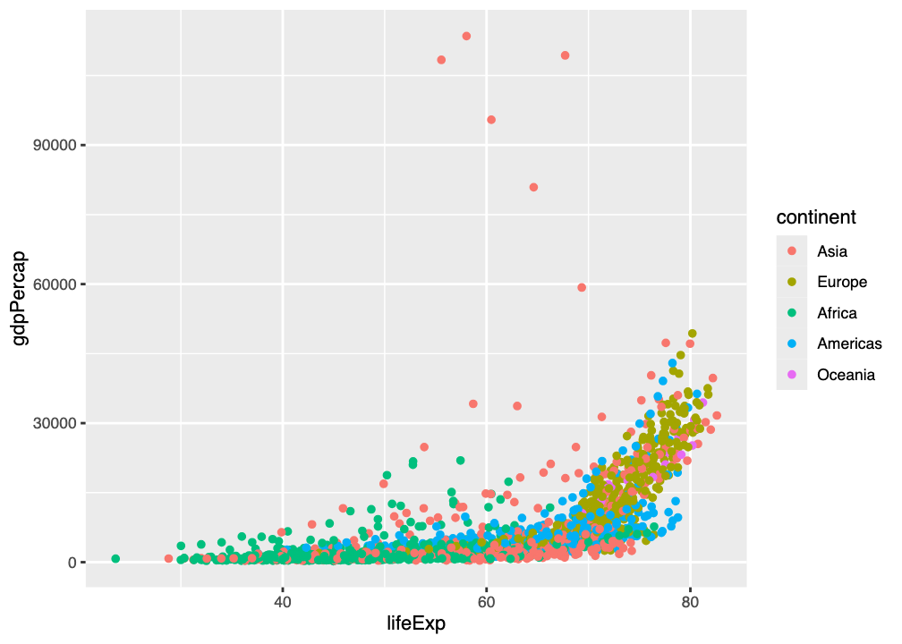
qplot() command showing GDP per capita against life expectancy, with points coloured by continent
2.5.1 Aesthetics
In this plot, every row in the table (we call each row an observation) is represented by a single point. How that point is rendered in the plot is determined by its aesthetics:
- The x position aesthetic determines where the point is rendered in relation to the side of the graph
- The y position aesthetic determines where the point is rendered in relation to the bottom of the graph
- The size of the point is an aesthetic
- The shape of the point is an aesthetic
- The colour of the point is an aesthetic
- The transparency of the point is an aesthetic
In ggplot2 these aesthetics can be constant (like shape in Figure 2.1 - datapoints are all filled circles), or mapped to - under the control of - variables in the dataset (like colour in Figure 2.1 - the colour depends on the continent).
We can generate many different kinds of plot from the same data just by changing the aesthetics
2.5.2 geoms
The other key thing to know about in ggplot2 is the idea of a geometry, or geom. The geom determines the kind of data representation for the plot. There are many kinds of geom in ggplot2, and combinations of aesthetic and geom can reproduce several kinds of plot (as in Figure 2.2).
All ggplot2 graphs are combinations of geoms and aesthetics.
We can demonstrate this in the WebR cell below. Use the following code to create a scatterplot:
p <- ggplot(data=gapminder, aes(x=lifeExp, y=gdpPercap, color=continent))
p + geom_point()The first line uses the ggplot() command to create the plot from the dataset (data=gapminder) with a set of aesthetics (aes(x=lifeExp, y=gdpPercap, color=continent)). This plot is put into a variable (p) for convenience so that we can experiment in the workshop.
Just defining the graph isn’t enough to show it. To do this we also need a geom
Because the plot is in the variable p, we can “add” a geom to it. We’ll add geom_point() so that it gives us a scatterplot, like that in Figure 2.1.
Replace the geom_point() in the WebR code with geom_line(). Does this give a better representation of the dataset?
2.5.3 Layers
Without even thinking about it, we’ve been using the concept of layers.
All ggplot2 plots are built from layers.
All layers have two components:
- data that will be shown, and aesthetics for showing the data
- a
geomthe defines the type of plot on that layer
The layers in the plot you created above are shown in Figure 2.3.
The ggplot() layer is the “base layer” and contains data and aesthetics (aes()). These are inherited by the other layers in the plot, such as the geom_point() layer (unless overridden).
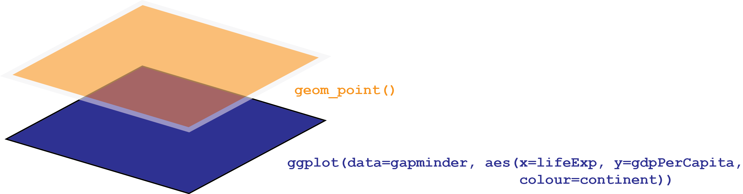
ggplot() layer is the “base layer” and contains data and aesthetics (aes()). These are inherited by the other layers in the plot, such as the orange geom_point() layer (unless overridden).
Using the WebR cell below, create a plot showing how life expectancy (lifeExp) changes as a function of time (year), as a scatterplot.
- Can you generate the graph by just changing variables in the code you’ve already written?
Use the same code as above, but put year on the x aesthetic/axis, and lifeExp on the y aesthetic/axis.
p <- ggplot(data=gapminder, aes(x=year, y=lifeExp, color=continent))
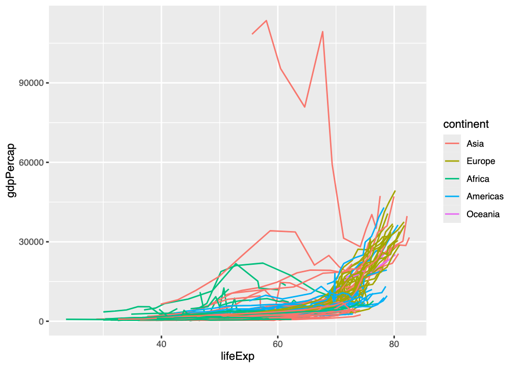
p + geom_point()We can build up additional layers of geoms to create more complex plots, and to apply aesthetics specifically to different layers. For example, we can plot GDP per capita (gdpPercap) against life expectancy (lifeExp) as a line plot (geom_line()), grouping points by country, but coloured by continent. The code for this is:
p <- ggplot(data=gapminder, aes(x=lifeExp, y=gdpPercap, color=continent))
p + geom_line(aes(group=country))
The layer structure of this plot is shown in Figure 2.4 (and the result in Figure 2.5)
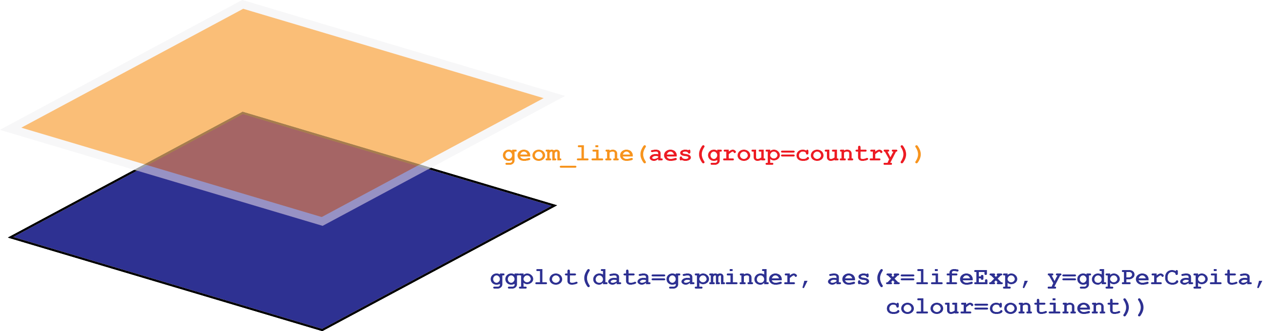
ggplot() layer is the “base layer” and contains data and aesthetics (aes()). These are inherited by the other layers in the plot, such as the orange geom_line() layer, but an additional aesthetic grouping points by country is added.
We can go on to add a top-level geom_point() scatterplot with each datapoint shown as a semitransparent (alpha=0.4) point by changing this code - in the same WebR cell:
p <- ggplot(data=gapminder, aes(x=lifeExp, y=gdpPercap, color=continent))
p + geom_line(aes(group=country)) + geom_point(alpha=0.4)
This gives the plot in Figure 2.6, which has the layer structure in Figure 2.7.
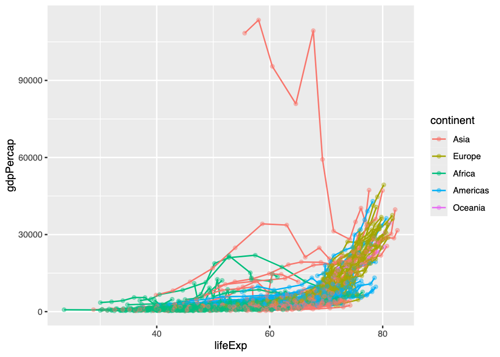
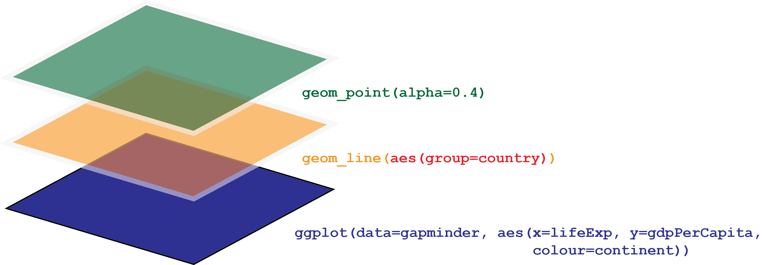
ggplot() layer is the “base layer” and contains data and aesthetics (aes()). These are inherited by the other layers in the plot, such as the orange geom_line() and green geom_point() layers, but additional aesthetics grouping points by country and changing the transparency of points is added.
Using the WebR cell below, create a plot showing how life expectancy (lifeExp) changes as a function of time (year), coloured by continent, with two layers:
- a line plot, grouping points by country
- a scatterplot showing each data point, with 35% opacity
- Can you generate the graph by just changing variables in the code you’ve already written?
Use the same code as above, but put year on the x aesthetic/axis, and lifeExp on the y aesthetic/axis, and changing the alpha parameter to 0.35.
p <- ggplot(data=gapminder, aes(x=year, y=lifeExp, color=continent))
p + geom_line(aes(group=country)) + geom_point(alpha=0.35)
2.6 Multi-panel figures
All the plots we have made so far have been single-panel figures. With large datasets, this can get a bit messy and obscure the story you want to tell with data.
ggplot2 has a layer called facet_wrap() which allows us to split data into panels on the basis of a variable. For example, the code below allows us to split the plot in Figure 2.6 into separate panels (or facets) for each continent:
p <- ggplot(data=gapminder, aes(x=lifeExp, y=gdpPercap, color=continent))
p + geom_line(aes(group=country)) + geom_point(alpha=0.4) + facet_wrap(~continent)Using the WebR cell below, create a plot showing how life expectancy (lifeExp) changes as a function of time (year), coloured by continent, with two layers:
- a line plot, grouping points by country
- a scatterplot showing each data point, with 35% opacity
and split this plot into facets by continent.
- Can you generate the graph by just changing variables in the code you’ve already written?
Use the same code as above, but put year on the x aesthetic/axis, and lifeExp on the y aesthetic/axis, and changing the alpha parameter to 0.35, and adding a facet_wrap() layer:
p <- ggplot(data=gapminder, aes(x=year, y=lifeExp, color=continent))
p + geom_line(aes(group=country)) + geom_point(alpha=0.35) + facet_wrap(~continent)
2.7 What’s next?
Now that you have learned some of the key features of how to make a ggplot2 figure, we’re ready to think about the experiment that’s providing us with data for this workshop, which you’ll meet in the next section.