6 Visualising Experimental Data
It may take a couple of minutes to install the necessary packages in WebR - please be patient.
Right-click on the links below to download the catheter and tissue data
6.1 Introduction
The experiment that was actually run to gather data on adherence to human tissue and catheter material ran into a few scheduling problems.
In the end, the experiment was run by multiple scientists in the group, and measurements were taken in groups of five datapoints, where all five measurements (corresponding to a single bacterial line) were collected in the course of an afternoon.
Each group, or batch, of five measurements contained results for only one of the WT (control), KO (knockout), empty (empty vector), and complement (complemented gene) lines.
There were eight such groups or batches for the human tissue experiment, and four for the catheter material experiment.
6.2 Task 1: Load and inspect your data
There are two data files containing your experimental data: tissue.csv and catheter.csv.
Use the WebR cell below to load your data into two variables: tissue for the human tissue experiment, and catheter for the catheter material experiment.
The column types are, in order: factor, number, integer, number, integer, integer, integer and can be expressed as "fniniii" for the col_types option in read_csv()
- Use
read_csv()to load your data into two different dataframes - Use
glimpse()orhead()to inspect the format of your data
Use the R code below to load your data
tissue <- read_csv("tissue.csv", col_types="fniniii")
catheter <- read_csv("catheter.csv", col_types="fniniii")
Use the R code below to inspect your data
glimpse(tissue)
glimpse(catheter)
6.2.1 The format of your dataset
Your dataset has been provided in a specific format to make plotting and analysis easier for this workshop.
This workshop focuses on demonstrating how to visualise, analyse, and interpret experimental data. The principles and techniques of cleaning and manipulating raw data into a suitable form for analysis is outside the scope of this material.
Explain the meanings of the columns and why they are the datatypes they are.
6.3 Visualise the datasets
6.3.1 The catheter material dataset
Use the WebR cell below to visualise the data from the catheter material experiment.
See if you can give the graph these properties:
- The categories/labels should be in this order on the x-axis, from left to right:
WT,KO,empty,complement - There should be one boxplot per category/label
- Each batch should be assigned a different colour for easy identification
- You can order the categories on the \(x\)-axis by replacing
x=labelwithx=factor(label, level=c("WT", "KO", "empty", "complement") - If you use
aes(colour=batch)in theggplot()base layer, then the boxplots will be split. To avoid this, useaes(colour=factor(batch))ingeom_jitter()instead.
Use the R code below to render your graph:
p1 <- ggplot(catheter,
             aes(x=factor(label, level=c("WT", "KO", "empty", "complement")),
                 y=logCFU)) +
  geom_boxplot() +
  geom_jitter(width=0.2,
              aes(colour=factor(batch))) +
  xlab("experiment")
p1
6.3.2 The human tissue dataset
You can use almost exactly the same solution as for the catheter dataset, but:
- change
p1top2to create a new graph rather than overwriting the old one - make sure you are working with the
tissuedataset
Use the R code below to render your graph:
p2 <- ggplot(tissue,
             aes(x=factor(label, level=c("WT", "KO", "empty", "complement")),
                 y=logCFU)) +
  geom_boxplot() +
  geom_jitter(width=0.2,
              aes(colour=factor(batch))) +
  xlab("experiment")
p2
6.4 Interpret the data
6.4.1 The catheter material dataset
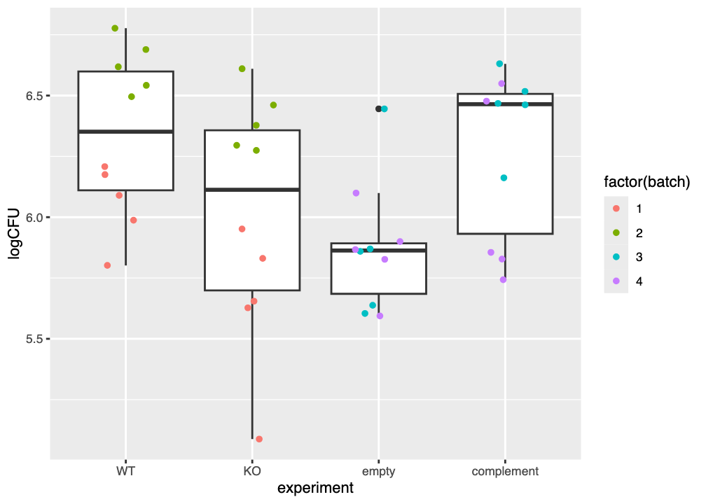
Your plot of the catheter data should look similar to that in Figure 6.1.
The \(y\)-axis shows the log of the colony-forming units (CFU) per millilitre, and is a measure of the amount of each type of bacteria (wild-type/control, etpD knockout, knockout with empty vector, and complemented knockout) that were recovered. The \(x\)-axis gathers the datpoints for each type of bacteria.
Each boxplot shows the median value as a thick horizontal line, a box between the 25th and 75th percentiles, and whiskers extending to no more than 1.5 \(\times\) the interquartile range (IQR) of the data. Datapoints beyond the whiskers can be considered as outliers.
Examine your plot (or Figure 6.1) and consider the questions below.
6.4.1.1 What is the overall effect of each bacterial variant?
The median logCFU of the wild-type (WT) control is approximately 6.35. What is the approximate logCFU of each of the three other bacterial lines?
KO(the etpD knockout)empty(the etpD knockout carrying an empty plasmid vector)complement(the etpD knockout carrying a plasmid vector that expresses the etpD gene)
- The
KOline has a median logCFU of 6.13 - The
emptyline has a median logCFU of 5.86 - The
complementline has a median logCFU of 6.46
Taking the wild-type WT line as a baseline level of “stickiness” to the catheter material. Based only on your graph (or Figure 6.1) Is the “stickiness” of each of the three remaining bacterial lines approximately greater than, less than, or about the same as the wild type?
KO(the etpD knockout)empty(the etpD knockout carrying an empty plasmid vector)complement(the etpD knockout carrying a plasmid vector that expresses the etpD gene)
- Fewer CFU/mL are recovered from the
KOline, so it seems to be less “sticky” than the wild type - Fewer CFU/mL are recovered from the
emptyline, so it seems to be less “sticky” than the wild type - About the same CFU/mL are recovered from the
complementline, so it seems to be about as “sticky” as the wild type
Does the empty line appear to be more “sticky”, less “sticky”, or just about as “sticky” as the KO line?
Fewer CFU/mL are recovered from the empty line, so it appears to be less “sticky” than the KO line.
Based on your answers above, do you think there is evidence that the etpD gene might contribute to adhesion of the bacteria to catheter material?
When the etpD gene is knocked out (KO) fewer CFUs are recovered from the substrate, which we can interpret as the bacteria being less “sticky.”
Similarly, when the etpD gene is expressed from a plasmid (complement) more CFUs are recovered than was the case for the KO, so it appears that restoration of the etpD gene might make the bacteria more “sticky,” i.e. contribute to increased adherence.
6.4.2 The tissue material dataset
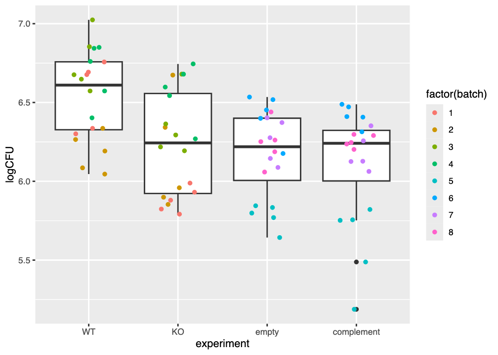
Your plot of the tissue data should look similar to that in Figure 6.2.
The \(y\)-axis here also shows the log of the colony-forming units (CFU) per millilitre, and is a measure of the amount of each type of bacteria (wild-type/control, etpD knockout, knockout with empty vector, and complemented knockout) that were recovered. The \(x\)-axis gathers the datpoints for each type of bacteria.
Each boxplot again shows the median value as a thick horizontal line, a box between the 25th and 75th percentiles, and whiskers extending to no more than 1.5 \(\times\) the interquartile range (IQR) of the data. Datapoints beyond the whiskers can once more be considered as outliers.
Examine your plot (or Figure 6.2) and consider the questions below.
6.4.2.1 What is the overall effect of each bacterial variant?
The median logCFU of the wild-type (WT) control is approximately 6.61. What is the approximate logCFU of each of the three bacterial lines?
KO(the etpD knockout)empty(the etpD knockout carrying an empty plasmid vector)complement(the etpD knockout carrying a plasmid vector that expresses the etpD gene)
- The
KOline has a median logCFU of 6.24 - The
emptyline has a median logCFU of 6.22 - The
complementline has a median logCFU of 6.24
Taking the wild-type WT line as a baseline level of “stickiness” to the catheter material. Based only on your graph (or Figure 6.1) Is the “stickiness” of each of the three remaining bacterial lines approximately greater than, less than, or about the same as the wild type?
KO(the etpD knockout)empty(the etpD knockout carrying an empty plasmid vector)complement(the etpD knockout carrying a plasmid vector that expresses the etpD gene)
- Fewer CFU/mL are recovered from the
KOline, so it seems to be less “sticky” than the wild type - Fewer CFU/mL are recovered from the
emptyline, so it seems to be less “sticky” than the wild type - Fewer CFU/mL are recovered from the
complementline, so it seems to be less “sticky” than the wild type
Does the empty line appear to be more “sticky”, less “sticky”, or just about as “sticky” as the KO line?
About the same CFU/mL are recovered from the empty line, so it appears to be approximately as “sticky” as the KO line.
Based on your answers above, do you think there is evidence that the etpD gene might contribute to adhesion of the bacteria to catheter material?
When the etpD gene is knocked out (KO) fewer CFU are recovered from the substrate, which we can interpret as the bacteria being less “sticky.”
However, when the etpD gene is expressed from a plasmid (complement) no more CFU are recovered than was the case for the KO, so it appears that restoration of the etpD gene does not by itself make the bacteria more “sticky,” i.e. contribute to increased adherence.
6.4.3 The influence of batch effects
As noted above, the experiment as performed involved obtaining measurements in groups of five. Each group of five measurements may have been obtained on a different day, by a different scientist.
Small differences between the way scientists work, or batches of chemicals, tissue, media, and reagents, can lead to systematic differences in results that are due to those changes and not to the biological influence under investigation (here, the effect of the etpD gene on bacterial adherence).
When inspecting experimental data, you should check for potential signs of batch effects using exploratory data visualisation. The visualisation you performed above is exploratory data visualisation.
- Do datapoints that are meant to measure the same thing seem to form a consistent grouping, or distinct and separate clusters?
- If you see clusters and colour the datapoints by a factor that is not meant to be a factor of interest in the experimental design (e.g. individual experimenter, date the measurement was obtained, media batch number) do these correlate with the clusters?
Some common visualisation and ordination techniques for identifying batch effects include PCA (principal component analysis) and MDS (multidimenstional scaling).
Rigorous experimental design is the best way to avoid batch effects and confounding. Techniques such as sample randomisation and statistical balancing can help to avoid unwanted and unanticipated batch effects.
Do you see evidence of batch effects in Figure 6.1 and/or Figure 6.2? Why do you think this?
There is clear visual evidence of batch effects in both Figure 6.1 and/or Figure 6.2.
For example, in Figure 6.1 the logCFU values for batches 1 and 2 are obviously grouped together and differ from each other, despite apparently measuring the same values. The evidence for a batch effect is less obvious for batches 3 and 4.
Likewise in Figure 6.2 the values for batch 5 are much lower than those for the other empty and complement batches. Values for batches 1 and 2 also appear to be systematically lower than for the other batches in the WT and KO lines.
If left uncorrected, these likely batch effects could introduce variation into the experimental results that prevents the correct (statistical) interpretation being made from the data.

