3 Reporter Gene Expression
3.1 Introduction
In this exercise you will use absorbance ratio data obtained from cloning your reporter gene downstream of a set of nine candidate kanamycin-responsive promoter regions.
Your reporter gene absorbs light at 700nm so, by using a spectrophotometer and measuring the attenuation of light at 700nm (OD700), you can estimate the amount of reporter gene that is produced.
It is not enough to only measure the absorbance due to the reporter gene. We are interested in how much reporter gene is produced by each cell. So we must take into account how many cells are present in the medium.
To see what we mean:
If 500 cells each produced 10 units of reporter gene, we’d expect around 5000 units of absorbance (\(500 \times 10 = 5000\)). But if there are only 100 cells producing 50 units of reporter gene each, we’d still expect around 5000 units of absorbance (\(100 \times 50 = 5000\)). A single measurement of OD700 alone could not tell the difference between these results.
We must also take the number of cells into account, so we also measure absorbance at 600nm (OD600) as a measure of cell density. Then, by taking the ratio of OD700 to OD600 (\(\frac{\textrm{OD700}}{\textrm{OD600}}\)) we can normalise the measurement of reporter gene by the amount of the organism that is present.
With our example above, assuming that one cell gives one unit of absorbance at 600nm:
- the situation with 500 cells producing 10 units of reporter gene each would have an OD700/OD600 ratio of \(5000/500 = 10\)
- the case of 100 cells producing 50 units of reporter gene would have an OD700/OD600 ratio of \(5000/100 = 50\)
and the resulting value represents the level of expression of the reporter per cell.
In this experiment, we are seeking a reporter system that responds to high concentrations of kanamycin by expressing, or switching on, the reporter gene. So we are looking for plasmids (here named pABS1.01 to pABS1.09) that have a strong expression response at high concentrations of kanamycin, but a weaker expression response at lower concentrations.
To find good candidate reporter systems, we plot the OD700/OD600 ratio (dependent variable) against kanamycin concentration (independent variable), to visualise which systems appear to have the reporter characteristics we are looking for.
In this part of the workshop, you will plot the ratio of your reporter absorbance (OD700) to your organism growth (OD600) against the concentration of kanamycin applied, using R, in order to identify good candidate reporters.
3.2 Load and inspect your data
Your data is in the file reporter_curves.csv, so load it into R using the read.csv() function, and inspect the format of your data, just as you did for the yeast growth data in Chapter 2.
Use the WebR cell below to load your data.
- Check back with Chapter 2 to see if you can use anything you’ve already learned
Use the R code below to load your data
data <- read.csv("reporter_curves.csv")
glimpse(data)
Your data contains three columns:
sample: this indicates which sample was measured (control, or plasmid ID)conc: the concentration of kanamycin that was appliedabs_ratio: the measure \(\frac{\textrm{OD700}}{\textrm{OD600}}\) ratio
3.2.1 Make a basic ggplot2 figure of your reporter data
You have loaded absorbance ratio data for nine candidate kanamycin reporters and a control sample. You’re going to plot these in the same way as you plotted the yeast growth data in Chapter 2.
Use the WebR cell below to make a scatterplot of your data, showing absorbance data against kanamycin concentration.
- Use the
ggplot()andaes()functions to create your base layer with the data, and how you want to group your data. - Use a
geom_point()layer to visualise the datapoints - You’re plotting the
abs_ratiocolumn againstconc, and grouping data bysample - Don’t forget to include a line that shows your figure!
- Check back with Chapter 2 to see if you can use anything you’ve already learned
Use the R code below to load your data
fig <- ggplot(data, aes(x=conc, y=abs_ratio, color=sample)) +
         geom_point()
figThe figure output shows the datapoints, but there are a lot of reporters, so there are a lot of colours. It’s difficult to track any single reporter because of the overlap between points, and confusion of colours.
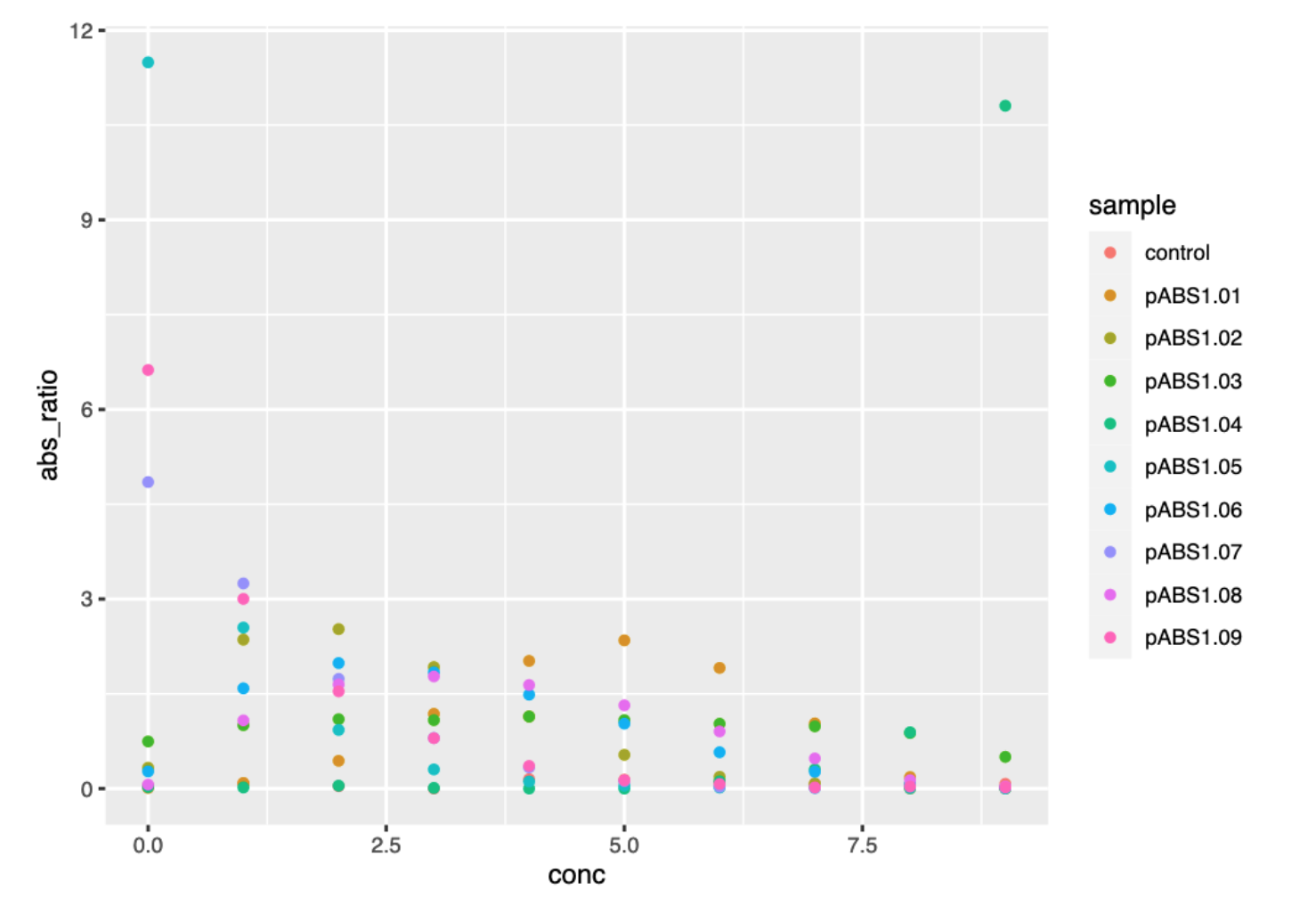
ggplot() graph of reporter absorbance ratios against kanamycin concentration.
3.2.2 Make a lineplot to help with visualisation
One of the advantages of ggplot2 is that it is easy to add and swap layers. We don’t only have to make a scatterplot, we can add a lineplot to our figure as well. We do this by adding a geom_line() layer.
Use the WebR cell below to add a lineplot to your data.
- Use a
geom_line()layer to visualise the datapoints - Don’t forget to use
+to add the layer!
- Check back with Chapter 2 to see if you can use anything you’ve already learned
Use the R code below to load your data
fig <- ggplot(data, aes(x=conc, y=abs_ratio, color=sample)) +
         geom_point() +
         geom_line()
figThe lines help to follow individual candidate reporters, but the plot is still jumbled up in the middle, and the similarities between some of the colours make it difficult to follow.
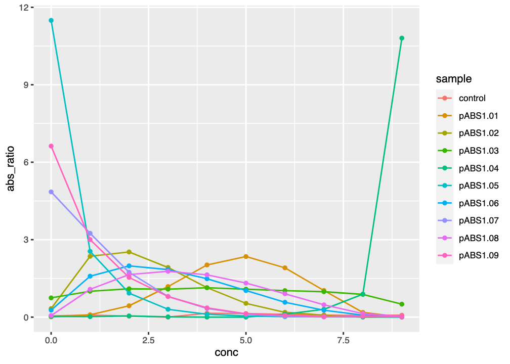
ggplot() graph of reporter absorbance ratios against kanamycin concentration, with lines to aid tracking data.
3.2.3 Use facets to make the visualisation clearer
Another advantage of ggplot2 is that we can quickly make major changes to the layout of a plot, in order to improve visualisation. Here, you will use facets to plot each sample separately in its own smaller subplot (called a facet). This is a common way to present data for multiple factors of interest, and will avoid the visualisation problems caused by overlapping lines with similar colours.
To do this, we use the facet_wrap() styling layer. We need to tell facet_wrap() what variable should be plotted in each separate facet. If we want to place each sample in its own facet, we would use facet_wrap(~sample) - NOTE: the variable sample is preceded by a tilde (~).
Use the WebR cell below to plot your figure with a separate facet for each sample.
- Use
facet_wrap(~sample)to make a separate subplot for each sample.
- Check back with Chapter 2 to see if you can use anything you’ve already learned
Use the R code below to plot your data
fig <- ggplot(data, aes(x=conc, y=abs_ratio, color=sample)) +
         geom_point() +
         geom_line() +
         facet_wrap(~sample)
figNow that we have a separate plot for each sample, it is easy to see which candidate reporters look like they might be worth taking forward. Notice that the \(x\)- and \(y\) axis scales are the same in each facet.
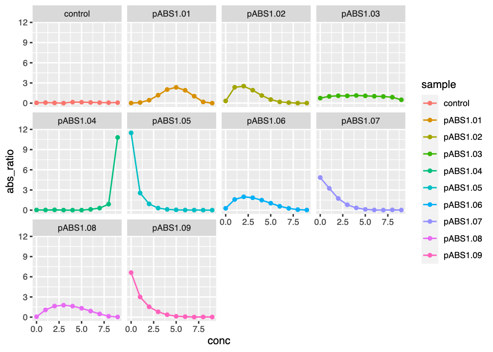
ggplot2 facet plot of reporter absorbance ratios against kanamycin concentration
3.2.4 Tidying up your figure
The current axis labelling of the figure could be improved. You can change the axis labels to something more meaningful by using the labs() styling layer. To change the \(x\)- and \(y\)-axis labels you might use a layer like labs(x="X-axis title", y="Y-axis title").
Use the WebR cell below to change the \(x\)-axis label to “[kanamycin]” and the \(y\)-axis label to “OD700/OD600”.
- Use
labs()with thex=andy=arguments to change the axis labels for your plot
- Check back with Chapter 2 to see if you can use anything you’ve already learned
Use the R code below to plot your data
fig <- ggplot(data, aes(x=conc, y=abs_ratio, color=sample)) +
         geom_point() +
         geom_line() +
         facet_wrap(~sample) +
         labs(x="[kanamycin]", y="OD700/OD600")
fig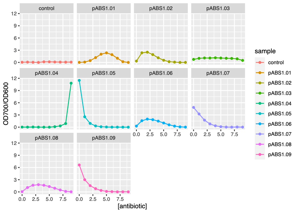
ggplot2 facet plot of reporter absorbance ratios against kanamycin concentration
3.2.5 Make a monochrome plot
You can change the presentation of your plot using the functions you learned in Chapter 2, to generate a monochrome plot ready for publication.
Use the WebR cell below to convert your plot to monochrome.
- use
scale_colour_grey()to convert colours to greyscale - use
theme_bw()to make the theme black and white - use
theme(panel.grid.major = element_blank(), panel.grid.minor = element_blank())to remove grid lines
- Check back with Chapter 2 to see if you can use anything you’ve already learned
Use the R code below to plot your data
fig <- ggplot(data, aes(x=conc, y=abs_ratio, color=sample)) +
         geom_point() +
         geom_line() +
         facet_wrap(~sample) +
         labs(x="[kanamycin]", y="OD700/OD600") +
         scale_colour_grey() +
         theme_bw() +
         theme(panel.grid.major = element_blank(),
               panel.grid.minor = element_blank())
fig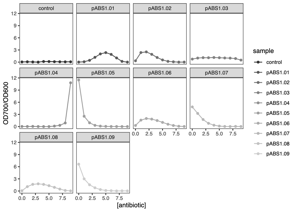
ggplot2 facet plot of reporter absorbance ratios against kanamycin concentration
3.3 Summary
After successfully working through this section you should be able to:
- import reporter gene expression/absorbance data into
R - use
Randggplot2to visualise expression/absorbance data - interpret the meaning of expression/abundance data
Please answer the questions below in the formative quiz on MyPlace